CSS3 Swipe Card Animation
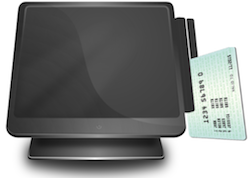
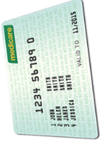
Anyway, one of the key features of this project is to indicate the patient/customer how to swipe the card when they look at the screen of the kiosk. Instead of reading the boring descriptions, a easy-to-understand animation would guide the patient to swipe the card correctly and properly. This sample code was inspired by Ben Everard's post on Github. It was all I needed to start decorating the layout of the swiping card screen.
In order to make it work, all you need is the below three images and the CSS3 code. You can design the images in Photoshop or Gimp or any other image editor.
- The kiosk image with left part of magnetic stripe reader
- The card with the face toward to the user
- The right part of the magnetic reader
Anyway, I have a sample animation at the end of this article which is applied by the sample code below.
Happy coding and have fun.
CSS3 Code:
@-webkit-keyframes swipe-card{
 0%{top:0px;opacity:0;}
 10%,50%{top:0px;left:350px;opacity:1;}
 65%{top:270px;left:380px;opacity:1;}
 75%,100%{top:260px;left:380px;opacity:0;}
}

@-moz-keyframes swipe-card{
 0%{top:0px;opacity:0;}
 10%,50%{top:0px;left:350px;opacity:1;}
 65%{top:270px;left:380px;opacity:1;}
 75%,100%{top:260px;left:380px;opacity:0;}
}

@-ms-keyframes swipe-card{
 0%{top:0px;opacity:0;}
 10%,50%{top:0px;left:350px;opacity:1;}
 65%{top:270px;left:380px;opacity:1;}
 75%,100%{top:260px;left:380px;opacity:0;}
}

.swipe-card{
 margin:auto;
 position:relative;
 display:block;
 width:600px;
 height:600px;
}

.swipe-card img{
 position:absolute;
}

.swipe-card .swipe-left{
 top:70px;
 left:0px;
 z-index:3;
}

.swipe-card .swipe-right{
 top:115px;
 left:382px;
 z-index:1;
}

.swipe-card .card{
 z-index:2;
 left:390px;
 top:90px;
 -webkit-animation:swipe-card 4s ease-in-out infinite normal;
 -moz-animation:swipe-card 4s ease-in-out infinite normal;
 -ms-animation:swipe-card 4s ease-in-out infinite normal;
 animation:swipe-card 4s ease-in-out infinite normal;
}
Html Code:
<div class="kiosk">
  <div class="swipe-card">
    <img class="swipe-left" src="your_image_path/kiosk-left.png" />
    <img class="card" src="your_image_path/med-card-front-swipe.png" />
    <img class="swipe-right" src="your_image_path/kiosk-right.png" />
  </div>
</div>
Demo Animation:


Related Posts
In case you missed it

It has been a while since I post a blog page on Blogger which was created back in 2013. So I took an opportunity to...
The standard paragraphs Welcome to this demo page! Here, you’ll get an exclusive preview of our cutting-edge platform designed to revolutionise your digital experience. Our...

Do you use your own domain name with Blogger? Do you place “Blogger’s Stats Widget” on your page? Or do you regularly check up the...